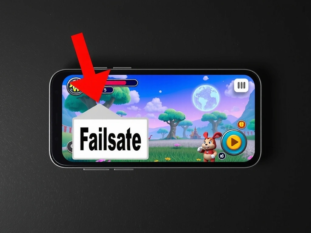
The Unspoken Rules of Mobile Game Onboarding
We break down the critical first-minute design decisions that separate retained players from immediate uninstalls.
Deep dives into mobile game mechanics, development stories, and the psychology of play. No buzzwords, no hype—just the craft.
"We don't ship features. We ship feelings. If a player doesn't feel the win, the mechanism has failed."
— Lena Kreis, Lead Designer
PHASE 1: PAPER
PALETTE LOCKED
GREYBOX
FINAL SHIP
We break down the critical first-minute design decisions that separate retained players from immediate uninstalls.
How we engineer sensory feedback systems to create addictive, rewarding player experiences.
A transparent look at how abstract ideas become polished, playable games.
Annotation from our teardown of 'Clash Royale' onboarding. The 'Training Camp' is a masterclass in safe exploration.
Allowing players to make low-stakes mistakes in early levels transforms frustration into a discovery moment. It builds intuition without a lecture.
We cap the number of "failable" interactions per level (max 2) and use a universal "oops" audio cue so players know the game isn't broken. After the third failure, we offer a subtle hint.
Terms we use daily and what they actually mean to us.
The cumulative sensory feedback (haptics, sound, particles, screen shake) that turns a digital action into a physical sensation. We distinguish it from 'polish'—juice is about *feeling*, polish is about *looking*.
A fully playable game with zero final art. Colors are placeholder, sounds are muted, animations are rough. The goal is to validate the core loop before investing in art. If it's not fun in greybox, no amount of polish will fix it.
The mental effort required to understand the game. We aim for minimal load in onboarding. A good rule: if a player is thinking "what do I press?", the UI has failed. They should be thinking about the puzzle, not the controls.
The opening and closing rituals of a play session. The first 10 seconds (wrapper-in) set the tone; the last 10 seconds (wrapper-out) determine if they return. We design the exit state as carefully as the entry.
The delay between a player's tap and the game's response. In mobile, we target <100ms for core actions. Any longer, and the player loses the sense of direct control. We test this on low-end devices as a priority.
The pattern of rewards (points, coins, levels) in a session. We avoid predictable patterns (every 3 levels) as they create expectation fatigue. Variable reinforcement (sometimes every 2, sometimes every 5) is more engaging long-term.
Before any project, we must have clear answers. You should too.
Not "what are they doing?" If the answer isn't "curious" or "confident," we pivot.
Can a player experience the core reward loop within 3 interactions? If not, we simplify.
We ship for the average, not the flagship. Performance is a design constraint from day one.
We design for the "last tap" feeling. A negative exit (loss, fatigue) kills retention. A positive exit (almost solved, curious) brings them back.
If the core mechanic isn't visually clear, it won't get past the App Store screenshot review.
Every feature has a cost in development time and player attention. If it's not essential to the core feeling, it goes.
Is the player making meaningful choices, or just following a script? We build for player agency, not scripted spectacle.
The Clock: It's 2:47 PM. A critical bug in the new "double-tap to select" mechanic is causing a 15% crash rate on Android 11 devices. The evening playtest is in 30 minutes.
The Constraint: Our lead programmer has a hard stop at 3:15 for a doctor's appointment. No full engine rebuilds allowed.
The Fix: We don't patch the engine. We implement a fallback animation in the UI layer. It's a 20-line JavaScript change, adds 8ms of lag, but eliminates the crash. The mechanic feels 95% as good, and the session is saved.
This is the trade-off we make daily: elegant engineering vs. playable shipping.
Our methods are open. Let's discuss how they can apply to your specific project constraints.